★ COLOPHON · NOTES ON THE BUILD
Katarina, a study.
A self-initiated editorial web feature, set as a brief to test how a single-page document can hold magazine-quality typography across two competing visual identities while using interaction as a narrative tool rather than decoration.
i.
Holding two visual identities in one document.
The feature splits into Part I (a formal, black-tie centerpiece) and Part II (a vivid, citrus-coded album release). Most editorial sites that try this end up reading as two separate pages stitched together. The solution was to keep the typographic system identical across both — Fraunces serif, Inter Tight body, JetBrains Mono for monospace tags — and let only the color temperature and section backgrounds shift. The reader feels a tonal change without losing the editorial voice that holds the page together.
A dedicated "Part I." and "Part II." divider sits between them, explicitly framing the shift as a narrative beat rather than a context switch.
ii.
Designing interaction that argues a point.
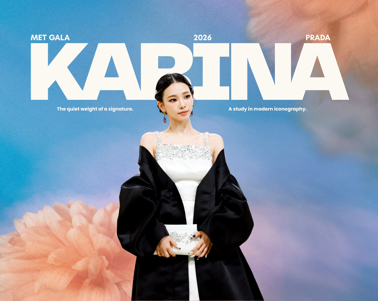
The Met Gala section needed to communicate craft-level fashion analysis — archive provenance, neckline construction, drape engineering — without becoming a wall of text. The solution was a custom 3D page-turning book element, built in pure CSS with transform-style: preserve-3d and a static-left-page swap pattern. Five spreads, navigated with prev / next / keyboard, each focused on one element of the dress: silhouette, archive, neckline, cape, the read.
The interaction model isn't decorative — it physically mimics how a fashion editor would flip through a designer's notebook. The form embodies the content.
iii.
A consistent design system across five graphic posters.
The page closes with a series of five collectible photocards — one per era. Each is an SVG poster, built from scratch, designed as a graphic statement rather than a photo container. They share a numbering system (CARD 01/05, roman numerals as ghost watermarks, the æ-001 → æ-005 progression at the bottom-right corner) but each works in its own visual register: stencil-and-claret debut, magenta hyperpop arrow, cosmic radial supernova, gold-on-black formal Met composition, lime-and-aubergine citrus splash for the album.
Clicking any card opens a modal with full editorial copy — quote, context, metadata table. The hover state lifts each card 18 px on a cubic-bezier spring; a small glass "↗ Tap to expand" pill descends from the top edge. The interaction language stays consistent with the page's editorial restraint while still feeling tactile.
iv.
Technical choices worth naming.
Liquid glass UI, mobile only. Real backdrop-filter + saturate surfaces on the floating jump menu, glass-tinted "Now Playing" pills on the music players, glass fact-tiles in the profile section. Wrapped in @supports so older browsers degrade to clean solid surfaces. The page reads as iOS-native on iPhone without ever applying the same treatment on desktop, where it would read as gimmicky.
Scroll reveals via IntersectionObserver. Twenty-four element classes animate in on scroll with staggered children. Wrapped in prefers-reduced-motion: reduce so users with motion sensitivity get the entire page rendered statically.
Verified data, not invented. The eight embedded music tracks are wired to actual verified Spotify IDs, cross-checked against the live catalog. The one unreleased album sits at /prerelease/{id} because that's where it actually lives on Spotify, with a custom pre-release card replacing the unavailable /embed/album/ URL — a small detail, but it's the difference between a polished portfolio piece and one that breaks the moment someone scrolls to it.
Light mode, pinned. color-scheme: light only, a theme-color meta tag, and an explicit background on the <html> element — three layers of declaration to prevent iOS Safari from inheriting the system dark mode preference for status bars and overscroll regions.
v.
What I'd do differently.
The page-turner book uses a static-left-page swap pattern that works but isn't perfect — mid-flip, the reverse face is briefly mirrored in 3D space. A polished publishing-grade flip would require a dedicated library (StPageFlip, turn.js) or a more elaborate per-spread snapshot system. For a self-contained single-file deliverable, the trade was justified. In a longer build I'd invest in the library route.
The hero figure on the Met Gala section relies on sourced imagery rather than commissioned photography. Disclosed in the footer; the ideal scenario would be a real editorial photo direction with an actual photographer.
This is a self-initiated concept editorial — a design exercise, not a commission. It features a real subject because real subjects bring specific dates, real albums, real fashion houses, and real archival references, and an editorial layout has nothing to test against if its content is abstract. It is not affiliated with, endorsed by, or produced for Karina, aespa, SM Entertainment, or any brand shown. Treat it as a portfolio sample of long-form editorial design and interaction craft, full stop.